This guide provides a detailed overview of each chart available in the Sequences tab, helping you understand and interpret key performance metrics such as enrollments, replies, bounce rates, and conversions. With this knowledge, you can accurately assess your results and optimize your outreach strategy for maximum effectiveness.
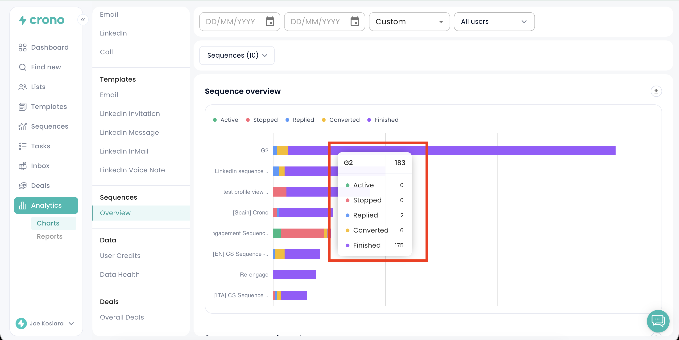
The Sequence Overview chart displays the status of all contacts enrolled in each sequence, categorized as follows:
Active (green): Contacts currently progressing through the sequence.
Stopped (red): Contacts who have been removed from the sequence, either manually or automatically.
Replied (blue): Contacts who responded with a negative sentiment, as identified by Crono’s sentiment analysis.
Converted (orange): Contacts who responded with a neutral or positive sentiment, indicating interest or positive engagement.
Finished (purple): Contacts who successfully completed all steps within the sequence.
At the top of the chart, you can adjust the time range and apply filters by user or sequence to focus on specific performance insights.
By hovering over each bar, you can view precise numbers and percentages, enabling you to easily evaluate and compare engagement and performance across different sequences.
