This guide explains how to interpret the metrics available in the Data section of Crono, enabling you to monitor user credit usage and maintain high data quality across your workspace.

This chart provides an overview of how different types of credits are being used by each team member within a selected timeframe. You can filter the results by user and date range to analyze specific usage patterns.
Enrichment Credits (blue): Represent how many times a user enriched contact or company data (e.g., retrieving email addresses, company information) succesfully.
AI Credits (yellow): Indicate how many AI-powered actions were performed, such as AI-generated replies or copy suggestions.
Phone Number Credits (pink): Track how many how many times a user enriched phone numbers succesfully.
Note that if the information is not found/enriched, the credit will not be consumed.
Hover over any bar to view the precise number of credits consumed in each category.
This visualization helps you monitor usage across your team, identify trends, and optimize the allocation of available credits.
This section allows you to evaluate the completeness and overall quality of your contact database.
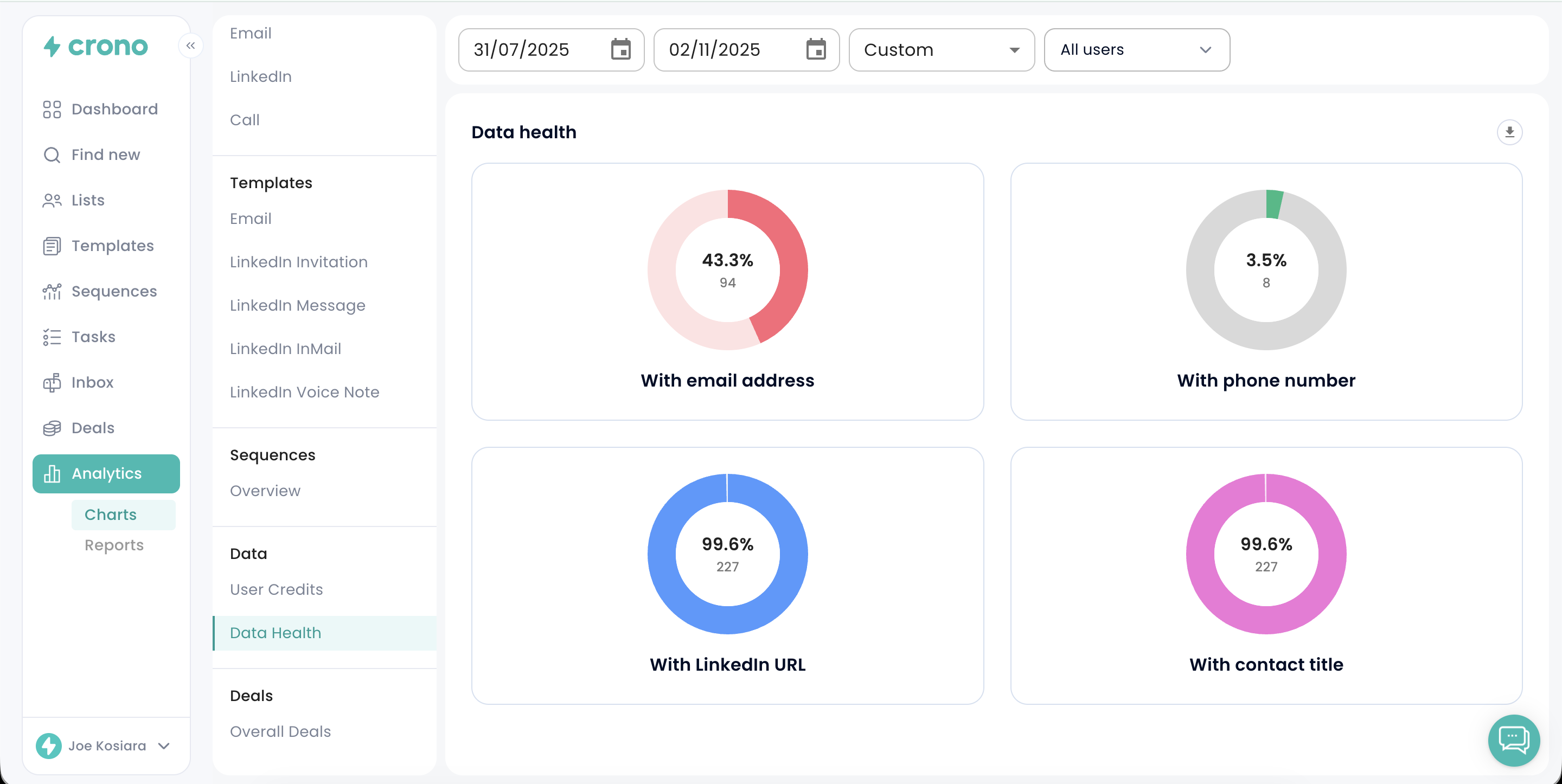
Each pie chart displays both the percentage and total count of contacts that contain key data fields:
With email address: Number of contacts with a valid email.
With phone number: Number of contacts with an associated phone number.
With LinkedIn URL: Number of contacts that include a LinkedIn profile link.
With contact title: Number of contacts with a job title specified.
These insights enable you to identify data gaps and determine where enrichment efforts may be needed to enhance your database accuracy and performance.
